Print-Ready Cosmetics Packaging: 10 Must-Do Checks

Print-Ready Cosmetics Packaging: 10 Must-Do Checks

Here’s a question that gets asked a lot, but doesn’t get answered well: “Is this artwork ready to go to print?” The question might seem simple, but in the complex world of cosmetics packaging, 20 other questions are concealed in that one question, each more specific than the previous. 

The truth is, many teams hit "send to print" thinking everything’s in place, only to later find out some blaring mistakes and loopholes. From missing address lines to dieline issues, wrong ingredient font size to incorrect logo placement. Even the smallest issue can trigger a far-reaching compliance issue.

So, what does “print-ready” really mean when it comes to cosmetics? This checklist will serve as a detailed guide to get your cosmetic packaging print-ready, without unnecessary mistakes and delays. 

The Top 10 Checks for Print-Ready Cosmetic Packaging

Print-ready cosmetic packages aren’t just a compliance requirement. They are equally important for consumer satisfaction, brand reputation, and market standing. Following a checklist can ensure all practical pre-print checks are in place, including dielines, bleed/safe zones, color tones, barcode scannability, etc. 

Here are 10 checks to carry out for your cosmetics packaging: 

1. The Principal Display Panel

If you’ve ever tried designing packaging for a jar, tube, or tiny bottle, you’ve probably wrestled with this: Which side is the front?

This might sound silly, but according to the FDA, the Principal Display Panel (PDP) is the part of the label most likely to be seen under standard retail conditions. 

  • If you have multiple PDPs, repeat the required information on each one
  • If you are unsure which panel serves as the PDP, carry out a mock display test to see what faces out naturally when stocked.
  • Check for print quality issues like low-contrast text and small fonts on a small batch of packages. 

2. Placement of Information

Designers sometimes follow a standard set of rules to place packaging information which tends to cause overcrowding or wrong placement of important information. Ask yourself: 

  • Is there enough room on the PDP for everything it legally needs to show, including identity, net quantity, warnings?
  • Have you clearly separated what's on the front vs. what’s on the info panel?
  • Are barcodes easily and accurately scanned? 
  • Ensure all regulatory information appears in the correct zones of your dieline, not across folds or glue areas

3. Prominence and Visibility

Information on a package doesn’t always read good in real-life. It needs to be prominent and clearly visible. 

  • Everything is visible and readable in typical lighting.
  • Ensure enough contrast between text and background. 
  • Place critical elements clearly at places where consumers would naturally look.

4. Language

Different regions have different language requirements for cosmetic packaging. For instance, in the U.S., all information needs to be in English. In regions like Canada or the EU, dual-language or multilingual labeling is often mandatory, make sure your design accommodates this. Check if: 

  • The translations are reviewed by a native speaker to capture the right tone and meaning.

5. Type Size

Small packages create big headaches, especially when it comes to type size. Make sure: 

  • Ingredient lists are at least 1/16 inch tall (or 1/32 inch if your total label area is under 12 square inches).
  • You follow type size rules for net quantity declarations based on the size of your PDP.

6. Identity Labeling

Product identity, regardless of what type of packaging, must be front and center. It should not be buried under branding or disguised as a tagline. Any consumer that picks up the product should be able to guess what it is, without much effort. 

Make sure the identity is:

  • In bold, easy-to-read text
  • Sized appropriately compared to other design elements

7. Name and Place of Business

The name and place of the business manufacturing or distributing the product is vital for accountability and traceability. It also helps handle recalls easily. Therefore, every cosmetic product that is sent to print must clearly mention: 

  • The name of the manufacturer, packer, or distributor
  • A full address (not just a PO box or website)

8. Net Quantity of Content Declarations

Net quantity is also a critical check printers need to ensure before printing cosmetic packaging. Make sure to check:

  • Is the net quantity statement in the bottom 30% of the PDP?
  • Is it aligned parallel to the base?
  • Is it bold, spaced out, and readable?

9. Warning Statements

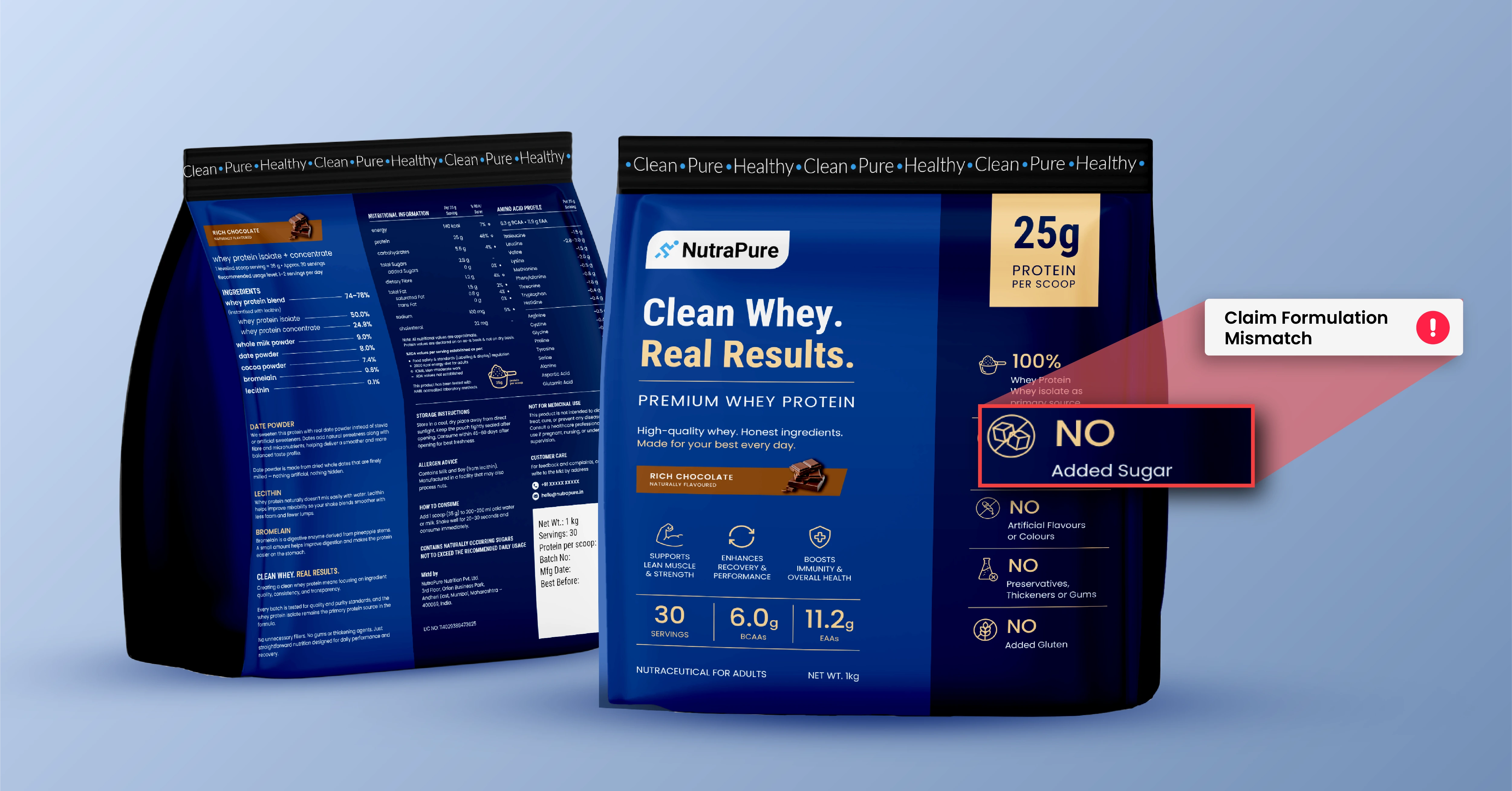
If your product contains active ingredients or poses any risk if misused, warning statements are non-negotiable.

  • Make sure they’re present on all relevant panels and not just the outer box.
  • Use bold, legible text, and make sure there’s enough contrast.

10. Ingredient Labeling

Ingredient names must be compliant with required standards and printed according to their type size. Make sure to: 

  • Use INCI names (the standardized cosmetic ingredient terms)
  • List in descending order by weight
  • Use the correct type size (and again, test print for legibility)

Conclusion

Cosmetic packaging compliance is essential, but it is just half the battle. Once your artwork is approved, it still needs to print cleanly, clearly, and consistently. And that’s where things often go sideways. Dielines, bleed, margins, and safe zones all need to be taken into consideration while sending any cosmetic packaging to print. These checks ensure proper content placement across the packaging, with no information getting lost in folds, cuts, or glue flaps. 

Using a modern automated cosmetic packaging management tool with such a built-in checklist is a great way to ensure compliance and print-readiness. At the same time, having real humans review the final packaging is key to ensure packaging looks aesthetically clean, neat, and legible. 

Remember: print-ready cosmetic artwork isn’t just about passing regulations or looking good on screen. It’s about ensuring that when your product hits the shelf, everything, from the font size to the barcode, works the way it’s supposed to.

Get this right, and you avoid delays, recalls, and awkward apologies. 

Learn how ManageArtworks can help you get every aspect of your cosmetic right with the perfect checklist!

Recent Blogs

Prêt à découvrir comment ManageArtworks fonctionne ?
Cela pourrait fonctionner pour vous ?

Correct
Gratuit pendant 14 jours
Correct
Aucun détail de carte n'est requis

Hear what Our Customers say

We wanted to streamline our label approval process with a functional program that could help us avoid human error, consolidate information, store assets, and provide timelines. ManageArtworks met all of these needs and is extremely user friendly, so our adoption to the software was seamless. The customer service and customization far exceed expectations.
The system's efficiency in handling artwork submissions, revisions, and approvals has not only saved us valuable time but has also enhanced collaboration among team members. Its automated notification feature has greatly reduced communication gaps and improved overall project coordination. the Artwork Management System has been a game-changer for us. Its reliability, ease of use, and comprehensive capabilities make it an indispensable tool for anyone dealing with artwork management.
ManageArtworks has significantly improved our workflows and artwork development process. The tool makes it easy to initiate new projects and set up timelines for artwork development. The ability to store all relevant information in one central location has been a game-changer as it allows us team members to collaborate and communicate seamlessly. Special thanks to the customer support team for their responsiveness and meaningful support.
ManageArtworks is an excellent product to work on with. With this tool, our artwork development timelines are coming down and efficiency is getting improved. This tool makes it easy for multiple departments to work together seamlessly. My special appreciation to the support team. They are extremely knowledgeable, listen to all the queries carefully, and come up with solutions quickly. They ensure that the new updates are implemented without disrupting our work.
What sets ManageArtworks apart from off-the-shelf document management systems (DMS), artwork management systems and other collaboration platforms in the market is the fact that it is an integrated solution that brings together DMS, workflows, record management (packaging records & batch records), advanced reporting, analytics and audit trails. Everyone at ManageArtworks from the leadership to the project manager, were willing and able to configure the solution as per our specific needs.
Parle Agro
We are in an FMCG Volume Business where end-to-end artwork ecosystem and quick turnaround time are critical elements. We wanted to digitalize the Artwork Management to eliminate human errors and improve turnaround time. At Parle Agro Ltd, we achieved these objectives with the implementation of the KAROMI ManageArtworks System. The KAROMI project and support team, along with senior management, have proven to be exceptionally supportive, knowledgeable, innovative, and committed throughout the journey.
Parle Agro
We needed a solution to manage our artwork development and approval process better, and found ManageArtworks. With this easy-to-use system, we have been able to effectively reduce time to market, increase productivity, and increase artwork review disciplines to help minimize errors.
Parle Agro
After a year of development, we adopted ManageArtworks for proofreading and validation. Following a trial in the French market, we expanded its use to subsidiaries and export.
This 100% English platform was quickly mastered by internal and external collaborators. It offers centralization, data security, traceability, and streamlined packaging reviews, saving time and effort. After 3+ years, it continues to receive unanimous praise and a growing user base!