How to Design Packaging That Gets Picked


Bringing a product to market is a long and complex journey — research, testing, redesigns, formulation, marketing campaigns, and supply chain coordination. But for all that effort, the purchase decision often comes down to a matter of seconds: will a shopper notice your product on the shelf and choose it?
That crucial moment is determined largely by your packaging artwork. While brand reputation and pricing influence buyers, packaging is often the very first thing they see. It must not only meet compliance requirements but also capture attention instantly.
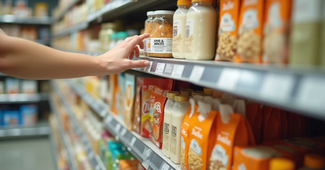
It’s tempting to assume your carefully designed label will always face forward, perfectly lit at eye level. The reality in stores is far less predictable. Products are stacked inconsistently, squeezed onto lower shelves, or hidden behind competitors. Often, the elements you most want to be noticed aren’t visible at all.
That’s why packaging has to succeed in less-than-ideal conditions. It should remain recognizable and engaging even when partially blocked or placed off-angle. Strong color contrasts, consistent visual identity, and messaging that works without perfect alignment all help ensure your pack still earns attention.
Designing packaging that gets picked requires balancing creativity, clarity, and compliance. Some strategies brands use successfully include:
Playful storytelling: Milgrad’s milk cartons, for example, feature cartoon characters that peek from the edges of the pack. Even when the carton isn’t fully visible, those characters draw attention and create recall.
Distinctive structures: Think of slim energy drink cans or uniquely contoured bottles. Structural design helps products remain identifiable even from the corner of a shelf.
Color disruption: In categories dominated by similar hues — like reds and yellows in snack foods — using an unexpected color palette can create immediate differentiation.
Premium finishes: Tactile elements such as embossing, metallic foils, or matte coatings invite consumers to pick up the product. This is especially effective in cosmetics and personal care.
Clear communication: Sometimes less is more. Clean layouts and strong typography can stand out in categories where competitors overwhelm with crowded information.
Coming up with bold packaging is rarely the problem. The frustration starts once that idea enters the approval cycle. Marketing would want standout visuals, regulatory would demand precision, quality double-checks every claim, and supply chain would push for speed. Each team has valid priorities, but together they create a slow, fragmented process. Adding to the complexity, premium finishes like embossed lettering or metallic foils will increase printing and manufacturing costs. Each priority is valid, but together they create a slow, fragmented process.
Instead of moving smoothly to the shelf, concepts stall in endless back-and-forth. Multiple “final” versions circulate, deadlines slip, and compromises creep in. What began as a disruptive design too often ends up watered down — safe, delayed, or stripped of the spark that would have made it memorable.
Strong ideas need strong execution to make it to the shelf. That’s where packaging artwork management comes in—not just to streamline processes, but to actively support creativity.
Platforms like ManageArtworks provide tools that help designers bring bold concepts to life: 3D visualization to preview packs in realistic settings, a dieline library to speed up design accuracy, and digital proofing to simplify feedback. These features ensure that great ideas don’t get diluted along the way and they reach consumers as intended.
Collaboration is equally important. ManageArtworks centralizes reviews so feedback doesn’t scatter across inboxes and drives. Compliance checks are built in from the start, removing the risk of last-minute legal surprises. And because teams always know which version is current, projects move forward with clarity and avoid costly rework.
With fewer delays and less confusion, designers can focus on what matters most: making the packaging itself compelling enough to stand out on the shelf.
On the shelf, packaging is your one guaranteed touchpoint with the customer. You can’t dictate placement or count on retailers to highlight your product, but you can control how effectively your design communicates. That’s why both creativity and process need to work hand in hand.
Brands that pair standout design with a streamlined packaging artwork process give themselves a real advantage. They don’t just launch faster; they launch packaging that is truer to the original idea and sharper in execution. In other words, they create packaging that doesn’t just look good in a design review — it gets picked in the store.

.webp)