The Rise of Radical Transparency in Food Packaging


Food brands are redefining how they communicate with consumers, and it’s happening right on the packaging. Gone are the days of vague marketing claims and hard-to-read ingredient lists tucked away on the back. Instead, brands are placing their ingredients front and center, embracing radical transparency.
This shift isn’t just about aesthetics, it’s about trust. As consumers demand more honesty about what they’re eating, food brands are realizing that clear, straightforward packaging artwork isn’t optional, it’s essential. And for brands to execute these changes seamlessly, having the right artwork management solution in place is critical.
Today’s consumers are more informed and skeptical than ever. They’re not just looking at the front-of-pack buzzwords, they’re flipping packages over, reading ingredient lists, and researching claims. With growing concerns about artificial additives, misleading health claims, and ultra-processed foods, transparency has become a key factor in purchase decisions.
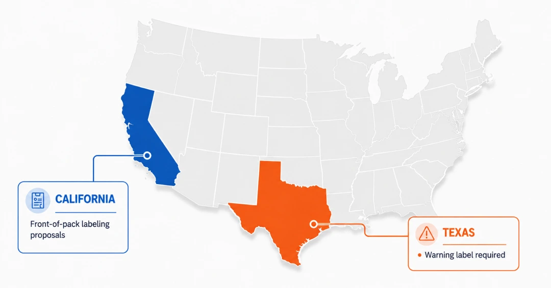
Regulatory bodies are also tightening their grip, pushing for clearer labeling and truth in advertising. Clean label movements, the rise of plant-based foods, and increased demand for ethical sourcing have all contributed to this packaging artwork evolution. Brands that embrace transparency aren’t just meeting consumer expectations; they’re staying ahead of compliance changes before they become mandatory.
Several brands have already made radical transparency a core part of their label and artwork management strategy:
RXBAR - One of the earliest brands to fully embrace front-of-pack ingredient transparency, RXBAR keeps things refreshingly simple. Each bar lists its ingredients in large, easy-to-read text right on the front, no unnecessary details, no hidden additives, just a clear list of what’s inside. With a “No B.S.” philosophy, the brand’s honest design approach has struck a chord with their health-conscious consumers.
Marks & Spencer - The UK retailer has taken a stripped-down approach with its cereal packaging, spotlighting simplicity over marketing jargon. In a very interesting move, their Corn Flakes package highlights “only 1 ingredient” with “Corn” listed underneath showcasing it in bold, easy-to-read text. The minimalist design makes it instantly obvious what’s inside, helping shoppers make faster, more confident choices.
Hu Kitchen - With a brand ethos of “Get back to human,” Hu Kitchen’s packaging states what their products contain and just as importantly, what they don’t. Their products call out the absence of refined sugars, dairy, and artificial preservatives right on the front, reflecting their real-food philosophy. The clean, muted design reinforces their commitment to minimal, high-quality ingredients.
The Whole Truth Foods - Radical transparency is built into the DNA of this brand. Every pack features a full list of ingredients front and center, with no fine print or hidden surprises. Their products, from protein bars to dark chocolates are made with clean, simple ingredients like dates and nuts. Beyond packaging, the brand actively educates consumers through Instagram and YouTube, tackling food myths and promoting informed eating.
These brands prove that transparency isn’t just a buzzword, it’s a competitive advantage.
For consumers, the shift toward open and honest packaging has made it significantly easier to make informed purchasing decisions. Instead of deciphering dense ingredient lists or navigating ambiguous brand claims, shoppers can now rely on clear, upfront information. This level of transparency builds trust, when brands plainly state what’s in their products, consumers feel more confident in their choices and are more likely to stay loyal. It’s a shift that aligns with the growing demand for authenticity and accountability in the food industry.
For companies, however, this growing expectation has prompted a fundamental change in how products are developed and marketed. Many are reformulating recipes to feature cleaner ingredient lists, redesigning packaging artwork to highlight essential information upfront, and reworking brand messaging to focus on honesty rather than hype. But transparency isn’t without its challenges. Displaying ingredients like added sugars or preservatives prominently can deter some buyers. Brands must carefully balance openness with thoughtful presentation to maintain both consumer trust and a positive brand image.
Radical transparency in food packaging isn’t just a passing fad, it’s a reflection of changing consumer expectations. But like any industry trend, its impact will be strongest while it's fresh. Brands that hesitate risk missing out, while early adopters gain consumer trust and market relevance.
To stay ahead, brands need to move fast, and that means having the right tools in place. Competitive artwork management solution like ManageArtworks ensures packaging updates are executed quickly, accurately, and in compliance with regulations. So, when trends like this emerge, brands can seize the opportunity without delays. Whether it’s redesigning labels to highlight transparency or rolling out new packaging artwork at scale, the right system makes all the difference.

.webp)